
Instructional Design
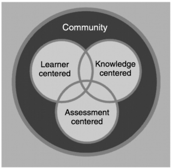
Regardless of what model you are following in your instructional design project, the most important theme is to create your materials according to the principles of how people learn. As we know from the famous book entitled How People Learn (HPL), effective learning environments are content centered, learner centered, assessment centered, and community centered. HPL diagrams this framework as follows (p. 134):
HPL is the most famous book ever written about learning theory. Its complete title is How People Learn: Brain, Mind, Experience and School. It was authored by the National Research Council in 2000. Even though it is dated, this book is widely regarded as the canonical work about how people learn. When the National Research Council convened to write an update, instead of replacing the 2000 volume, in 2018 they published a second volume entitled How People Learn II: Learners, Contexts, and Cultures. Both volumes are freely available online, and if you want a printed copy, Amazon sells the books at a reasonable price. Follow these links if you want a copy:
- How People Learn: Brain, Mind, Experience and School. Free Online copy or Amazon printed book.
- How People Learn II: Learners, Contexts, and Cultures. Free Online copy or Amazon printed book.
From the first volume, we learn three core principles about how people learn:
- Constructivism. People learn by connecting new information to concepts already learned.
- Situated Cognition. To learn how to reason, solve problems, and augment knowledge in a field of inquiry, people need to understand facts and ideas in the context of a conceptual framework that facilitates application to real-world problem solving.
- Metacognition. People are motivated to learn when they can set their own goals, reflect on their progress, and feel in control of their learning.
From these principles, it follows that learning environments will be effective when instructional designs:
- Consider the learner’s preexisting understandings and correct any faulty preconceptions in order to prevent future misunderstandings.
- Enable students to study multiple examples of the concept at work in order to learn it in depth in authentic contexts.
- Include metacognitive supports that make visible the learner’s reflections and enable an instructor to provide scaffolding and guide revisions to improve student learning and reasoning.
If you are a busy person as you probably are, you may not have time to read these entire books about how people learn. I would urge you at least to read Chapter 1 of the original volume, which is regarded as the best article ever written about how people learn. Follow this link to read Chapter 1 freely online.
Multimedia Learning Principles
The second volume of How People Learn (HPL) focuses on learners, contexts, and cultures. Viewing learning as a social activity, it considers the role of culture in learning and development. After discussing processes that support learning, knowledge, and reasoning, HPL recommends interventions for increasing the motivation to learn. Following a discussion of implications for learning in school, there is a wonderful chapter about digital technology. When discussing the challenges of designing instructional materials for delivery on mobile personal devices, HPL recommends the multimedia learning principles researched by the renowned educational psychologist Richard Mayer.
In his book entitled Multimedia Learning, Mayer (2021) organizes these principles in three categories. First, there are 5 principles that reduce extraneous processing, as illustrated in Table 1. Second are 3 more principles that help students manage essential processing, as illustrated in Table 2. Third are 7 principles that foster generative processing, as shown in Table 3. In total there are 15 principles, and these tables show their effect size measured in dozens of studies Mayer carried out with the help of his many research assistants. As HPL cautions, some of these principles may seem to overlap, so it would not be feasible to follow them all at once. Instead, you think about the nature of your instructional task and strategize which principles to prioritize in your design. In my case, I have always admired Mayer for teaching me about the Personalization principle, which you see in Table 9-3. Imagine being able to achieve a letter grade improvement in results simply by writing your instructional materials in conversational rather than formal style. Conversational means you write in first and second person (I, we, you) instead of the more formal third person (they, it, them). Ever since learning this principle from an earlier edition of Mayer’s book, I have written all my books in conversational style.
Table 1. Multimedia Learning Principles to Reduce Extraneous Processing
Effect on Learning |
Effect Size |
Studies |
|
1. Coherence |
People learn better when extraneous material is excluded rather than included. |
0.86 |
18 of 19 |
2. Signaling |
People learn better when cues are added that highlight the organization of the essential material. |
0.70 |
26 of 28 |
3a. Redundancy |
People do not learn better when printed text is added to graphics and narration. |
0.10 |
8 of 12 |
3b. Redundancy |
People learn better from graphics and narration than from graphics, narration, and printed text, when the lesson is fast-paced. |
0.72 |
5 of 5 |
4. Spatial Contiguity |
People learn better when corresponding words and pictures are presented near rather than far from each other on the page or screen. |
0.82 |
9 of 9 |
5. Temporal Contiguity |
People learn better when corresponding words and pictures are presented simultaneously rather than successively. |
1.31 |
8 of 8 |
Table 2. Multimedia principles to manage essential processing.
Principle |
Effect on Learning |
Effect Size |
Studies |
6. Segmenting |
People learn better when a multimedia lesson is presented in user-paced segments rather than as a continuous unit. |
0.67 |
7 of 7 |
7. Pre-training |
People learn better from a multimedia lesson when they know the names and characteristics of the main concepts. |
0.78 |
10 of 10 |
8. Modality |
People learn better from graphics and narration than from graphics and onscreen text. |
1.00 |
18 of 19 |
Table 3. Multimedia principles to foster generative processing.
Principle |
Effect on Learning |
Effect Size |
Studies |
9. Multimedia |
People learn better from words and pictures than from words alone. |
1.35 |
13 of 13 |
10. Personalization |
People learn better when words in multimedia lessons are in conversational style rather than formal style. |
1.00 |
13 of 15 |
11. Voice |
People learn better when the narration in multimedia lessons is spoken in a friendly human voice rather than a machine voice. |
0.74 |
6 of 7 |
12. Image |
People do not necessarily learn better from a multimedia lesson when the speaker’s image is added to the screen. |
0.20 |
4 of 7 |
13. Embodiment |
People learn more deeply from multimedia presentations when an onscreen instructor displays high embodiment rather than low embodiment. |
0.58 |
16 of 17 |
14. Immersion |
People do not necessarily learn better in 3D immersive virtual reality than with a corresponding 2D desktop presentation. |
-0.10 |
6 of 9 |
15. Generative |
People learn better when they are guided in carrying out generative learning activities during learning. |
0.71 |
37 of 44 |
Universal Design for Learning (UDL)
True to its name, Universal Design for Learning (UDL) is a framework for creating multimedia learning materials that are inherently accessible by all learners. Follow this link to see the UDL Guidelines for designing accessible multimedia learning materials.
A challenge for instructional designers is how to create these kinds of active learning scenarios in an online environment. The following article reports the results of interviewing expert instructional designers about how they do this. See especially the questions asked (listed in the appendix) for a list of possible ways of achieving active learning online.
- Rogers, S. & Gronseth, S. L. (2021). Applying UDL to Online Active Learning: Instructional Designer Perceptions. The Journal of Applied Instructional Design, 10(1). https://dx.doi.org/10.59668/223.3748 JAID direct link https://jaid.edtechbooks.org/jaid_10_1/applying_udl_to_onli
Web Accessibility
Due to the prevalence of the World Wide Web in delivering instructional materials, no course about instructional design would be complete without addressing the vital importance of following the Web accessibility standards.
Web accessibility is a framework making it possible for users with special needs to receive, understand, and navigate content that people without disabilities can process in lieu of such special assistance. There are many kinds of disabilities. The Web accessibility guidelines currently in force address not only the needs of seeing or hearing-impaired users, but also users with other kinds of disabilities, such as physical motion impairments and mental cognitive differences.
Accessibility Is a Right
Under federal procurement rules in the United States, Web accessibility is a right that is guaranteed by law under Section 508 of the Rehabilitation Act of 1973, as amended in 1998 and revised in 2017. According to the Section 508 law, a website is accessible when users with special needs can access it as well as people without disabilities. The law requires that all websites (as well as other forms of information technology) used, procured, developed, or maintained by government agencies and departments, must be accessible. If your school or business is receiving any kind of federal funding, therefore, the law may require you to follow the accessibility standards that will be presented in this chapter. Whether or not the law applies to your particular situation, the standards are not difficult to implement. Printed below are step-by-step instructions for creating Web pages that are compliant. On behalf of users with special needs, I encourage you to follow these guidelines, regardless of whether the law requires them in your workplace.
W3C Web Accessibility Initiative (WAI)
In 1997, the World Wide Web Consortium (W3C) launched the Web Accessibility Initiative (WAI), which coordinates the Web’s official efforts to achieve accessibility. WAI went right to work introducing HTML mechanisms for making Web page elements accessible. To provide Web authors with guidance in using the new accessibility features, the WAI issued a set of guidelines called the WAI Web Content Accessibility Guidelines (WCAG).
WCAG had a major impact on Section 508. As amended in 1998, Section 508 required websites to conform to level A of WCAG version 1.0. Nearly two decades later, the Section 508 accessibility standards were updated in 2017. The update raised the bar by requiring conformance at level AA of WCAG 2.0. According to the update’s safe harbor provision, content created before January 18, 2017 that complies with the legacy 508 Standards need not be modified or upgraded to conform to the revised 508 standards. If changes are made in the legacy content, however, it must be upgraded to conform to current standards.
WAI Web Content Accessibility Guidelines
The Web Content Accessibility Guidelines (WCAG 2.0) consist of 61 checkpoints organized under 12 general guidelines. Each checkpoint is assigned to one of three priority levels, which define the degree to which the site is accessible. Priority 1 is defined as a checkpoint that must be met, otherwise many users with disabilities will find it impossible to access the material. Priority 2 is a checkpoint which should be met, otherwise users will find it difficult, but not impossible, to access the material. Priority 3 is a checkpoint that may be met, in order to further access to Web documents. There are three levels of conformance called A, AA, and AAA, respectively. Conformance level A requires that a site pass all Priority 1 checkpoints. Conformance level AA (pronounced double-A) requires the passing of all Priority 1 and 2 checkpoints. Level AAA (triple-A) requires that a site pass all of the checkpoints at Priorities 1, 2, and 3. Depending on the level at which a website claims to conform, the site’s pages can display one of the three conformance logos defined in Table 4.
Table 4. WCAG Conformance Logos.
| Logo |
Meaning of the Logo |
|---|---|
 |
Conformance Level A: this page satisfies all Priority 1 checkpoints. |
 |
Conformance Level Double-A: this page satisfies all Priority 1 and 2 checkpoints. |
 |
Conformance Level Triple-A: this page satisfies all Priority 1, 2, and 3 checkpoints. |
Complying with Web Accessibility Standards
Table 5 enumerates the twelve general guidelines of the WCAG 2.0 Web accessibility standards. Below the table is a brief guide to creating accessible Web pages that comply with these rules. For more detailed examples, follow these links to the Techniques for WCAG 2.0 and the quick reference guide to the WCAG. As you peruse these links, you will notice another level of WCAG numbered 2.1. To keep WCAG 2.1 compatible with WCAG 2.0, it uses the same general guidelines, to which additional criteria have been added in support of users with learning disabilities, low vision, and disabilities on mobile devices. When this book went to press, Section 508 did not yet require WCAG 2.1 conformance, rather Section 508 requires conformance at level AA of WCAG 2.0.
Table 5. General Guidelines in the WCAG 2.0 Web Accessibility Standards
| Guideline |
Web accessibility requirement |
|---|---|
1 |
Perceivable |
1.1 |
Text Alternatives: Provide text alternatives for any non-text content so that it can be changed into other forms people need, such as large print, braille, speech, symbols or simpler language. |
1.2 |
Time-based Media: Provide alternatives for time-based media. |
1.3 |
Adaptable: Create content that can be presented in different ways (for example simpler layout) without losing information or structure. |
1.4 |
Distinguishable: Make it easier for users to see and hear content including separating foreground from background. |
2 |
Operable |
2.1 |
Keyboard Accessible: Make all functionality available from a keyboard. |
2.2 |
Enough Time: Provide users enough time to read and use content. |
2.3 |
Seizures: Do not design content in a way that is known to cause seizures. |
2.4 |
Navigable: Provide ways to help users navigate, find content, and determine where they are. |
3 |
Understandable |
3.1 |
Readable: Make text content readable and understandable. |
3.2 |
Predictable: Make Web pages appear and operate in predictable ways. |
3.3 |
Input Assistance: Help users avoid and correct mistakes. |
4 |
Robust |
4.1 |
Compatible: Maximize compatibility with current and future user agents, including assistive technologies. |
Creating Alternate Text for Images Onscreen
Most important in accessibility is providing alternate text for images onscreen. When users with seeing impairments access your project, they rely on this alternate text explaining what they cannot otherwise see. Whenever you put an image onscreen, you should always make alternate text describing what the image depicts. To create alternate text, you right-click the image (Mac users control-click) and choose the option to provide alternate text. Figure 1 shows the dialog that pops out when you do this using Microsoft products such as MS Word and PowerPoint.
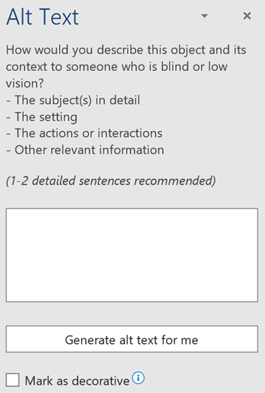
Figure 1. Alternate text dialog.
Conveying Color-coded Information from Context or Markup
A significant number of users are color blind. About 10% of males, for example, are unable to perceive red or green. About half of a percent of females have similar difficulties distinguishing between red and green. That is why guideline 1.4.1 forbids using color to convey information that cannot be understood in the absence of color. Whenever you are color coding a chart or a graph, therefore, make sure there is an alternate way in which someone who is color blind can understand the color-coded information.
You must also avoid navigational instructions that rely solely on color. Telling the user to press the red button, for example, violates guideline 1.4.1. To bring such a statement into compliance, you could print the word stop inside the button and tell the user to press the red stop button. Thus, users who cannot see red can identify the button via the word stop.
When printing text on colored backgrounds, you must make sure that your color choices contain enough contrast. The following example in Table 6 will sensitize you to the issue. On the left you see how people with different kinds of color blindness perceive a color combination which seems to have enough contrast but is lacking in blue hues. On the right, you see the same image with more blue hues. Notice how the green text in the source image on the left is indecipherable by someone with a green color deficit, which is called deuteranopia. The foreground text in the source image on the right contains more blue, thereby creating better contrast.
Table 6. Color Blindness Comparison of Protanopia, Deuteranopia, and Tritanopia.

|
Source image |
 |

|
Protanopia |
 |

|
Deuteranopia |
 |

|
Tritanopia |
 |
Screen Blinking
Strobing, flashing, blinking, or flickering more than three times per second can induce seizures in users with certain genetic dispositions. To avoid the possibility of websites inducing seizures, guideline 2.3 forbids flickering more than three flashes in any one-second period.
Animations that make things blink are not particularly desirable at a website. Most users will quickly tire of the repetition, and people who are easily distracted will have a hard time concentrating on a text when something is moving in their field of vision onscreen. To learn more about the risk of inducing seizures from flicker at a website, follow this Wikipedia link to photosensitive epilepsy.
Accessibility Checkers
This chapter has presented many rules and suggestions for ways in which you can increase the accessibility of a website. You can spend many hours working to meet these guidelines. When will you know, however, that you have done enough for the site to be considered compliant?
Happily, there are tools you can use to determine the extent to which a website complies with the accessibility guidelines. These tools can analyze the code of any Web page, report specific rules and guidelines that the page may be violating, and suggest improvements you can make to bring the page into compliance.
WAVE
Originating in Temple University and created under a grant from the special education division of the United States Department of Education, Wave is a Web accessibility evaluation tool operated by WebAim as a free community service. WAVE tests Web pages for compliance with the U.S. Section 508 guidelines and the W3Cs Web Content Accessibility Guidelines (WCAG 2.0).
You can use the WAVE online service to check any Web page online, or you can install the WAVE Extension which lets you check any Web page for compliance as it is viewed by the Chrome or Firefox browser. WebAim advises that Web pages powered by JavaScript are better evaluated using the WAVE extension than by the online service.
A sidebar lets you choose to view a report summary, details, documentation, or an outline of your document structure. Viewing modes let you see the report with styles, no styles, or contrast. The contrast mode computes the contrast ratio and indicates the extent at which you passed the WCAG AA and AAA requirements.
Ally
From Blackboard comes a tool called Ally that plugs into learning management systems including not only Blackboard but also Canvas, Desire 2 Learn (D2L) Brightspace, and Moodle. Ally checks course content for accessibility. For each page, authors can see whether their accessibility score is low, medium, high, or perfect. Ally can also convert content into alternate file formats including PDF, EPUB, Electronic braille, and audio. For more details, follow this link to Blackboard Ally.
W3C Catalog of Web Accessibility Tools
The World Wide Web consortium’s Web Accessibility Initiative catalogs Web accessibility tools at https://www.w3.org/WAI/ER/tools. This catalog has a sidebar that lets you set filters to display tools for evaluating compliance against WCAG guidelines as well as national guidelines from countries including Germany, France, Japan, Ireland, Korea, and Italy. You can filter for authoring tools, browser plugins, command line tools, online tools, and desktop or mobile applications. A technology filter lets you see tools for evaluating CSS, HTML, PDF, SVG, PDF, or JavaScript. A license filter lets you see products that are commercial, free, open source, trial or demo.
