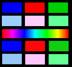
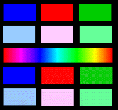
Web Color Examples
This page offers an example of what happens on your monitor when you reduce colors to the 216 palette for the GIF format. The images were made in Photoshop; Colors were indexed using the Web 216 color option.
The top two rows of tiles were filled with colors from the Web safe palette. The rainbow spectrum was a default fill in Photoshop. The bottom two rows of tiles while, very close in color to the top two rows, were filled with "unsafe" Web colors.
Experimentation is always required when working with multicolored images. One process may work well for one image and not for another. When working with a limited color palette, such as the ones below, the Web 216 Palette will work well.
PhotoShop's 256, Adaptive, Diffusion dither option was used in this image. |
Photoshop's Web 216, Diffusion dither option was used in this image.
(Notice the dots in the solids) | 
Photoshop's Web 216, no dither option was used in this image.
(Notice banding in gradation) |
When working with more colorful and complex images like photographs and paintings, the Web palette option is not always the best choice.
 Photoshop's 256, Adaptive, Diffusion dither. |
 Photoshop's Web 216, Diffusion dither |
 Photoshop's Web 216, no dither. |
 Photoshop's Mac System, 256, no dither. |
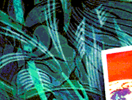 Photoshop's Windows 256, no dither. | |
|
|
Below are examples of a simple red button made in Photoshop with a Web safe red. Notice how the different indexing options effected the image.

256, Adaptive, diffusion |

Windows, diffusion |

Windows, none |
| |

Mac, diffusion |

Mac, none |
|

Web 216, diffusion |

Web 216, none |