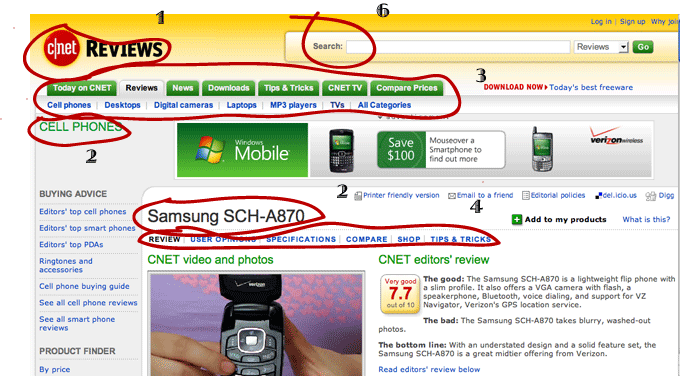
SiteID
- Very obvious and easy to spot on the page
- Sticks with upper left side convention
- Button may not be clear which web site it links to
PageName
- Samsung SCH-A870 alot lower than other content
- Section title is isolated on upper left
- Page name frames the content in the page
Sections
- Main sections and subsections stand out at top of the page
- Tabs make it clear that the subsections we see are part of Reviews
- Tab gives visual illusion the active tab is in front of the other tabs
- Persistent navigation holds alot of information on top of page
LocalNav
- Links specific to the page are right under page name
- Section links are conventional on right hand side
Breadcrumbs
- No obvious breadcrumbs list of how the user got to the page or other sections around it
- Tabs are very evident to help user see where they are
- Section Name "Cell Phones" gives more clues but can be confused as page name
Search
- In an obvious spot, can easily find
- Nothing to confuse the user, such as instructions or strange wording
- Scope of search defined all the way on right so not to confuse
 |
This is the original image. Notice the blank space on the top of the page and how far down the content actually starts |
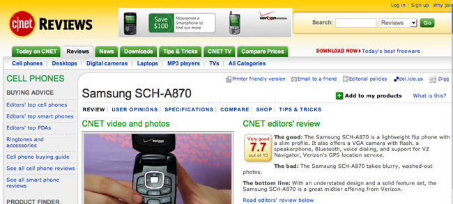 |
This is a proposed mark up of the site. I used the blank space on for relocating the advertisement. This created room to move up the content and line it up so it is more clear hierarchically. Now, the links in the green on the left are clearly under the "Cell Phones" subsection. Also the page title is very clear and prominent, and everything in the white space applies to that particular title. |

|

|