DEPARTMENT OF POLITICAL SCIENCE
AND
INTERNATIONAL RELATIONS
Posc/Uapp 815
Descriptive Statistics

- AGENDA FOR CLASS 5:
- Finish discussion of compound tables.
- Methods for summarizing data "batches"
- Reading:
- Agresti and Finlay, Statistical Methods, pages 35-44.
- Lewis-Beck, Data Analysis, pages 1-8
- DISPLAYING DATA: STEM-AND-LEAF DISPLAYS:
- Here again are the abortion data for Canadian provinces
- Although the table is fairly easy to read and interpret, let's see if we can summarize
its information.
| Table 1
Number of therapeutic abortions in 1988 in Canada
per 100 live births.1 |
Province |
ID
Number |
Rate |
Province |
ID
Number |
Rate |
Alberta |
01 |
15.0 |
British
Columbia |
02 |
25.5 |
Manitoba |
03 |
16.6 |
New
Brunswick |
04 |
4.9 |
Newfoundland |
05 |
6.3 |
Nova Scotia |
06 |
14.2 |
Ontario |
07 |
20.9 |
Prince Edward
Island |
08 |
3.5 |
| Quebec |
09 |
14.7 |
Saskatchewan |
10 |
7.7 |
| Yukon |
11 |
22.6 |
Northwest
Territories |
12 |
17.9 |
- A stem-and-leaf display is a "picture" that shows the 1) central tendency, 2)
dispersion, and 3) shape of a batch of numbers.
- By having a stem-and-leaf display we can see at glance some of the main
properties of the data. We can also use the display to obtain further insights and
statistics.
- A stem-and-leaf display consists of a column of digits called the starting parts or
stems, separated by a vertical line from rows of digits called leaves. Each number
in the batch is divided into a stem and a leaf and then placed in the display.
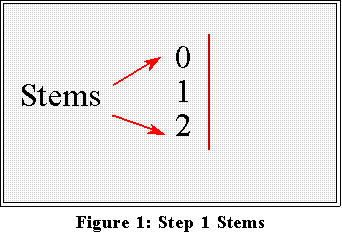
- To construct a stem-and-leaf display follow three simple steps:
- First, choose a set of stem values.
- Second, write down a column of these stems and draw a vertical line to the
right of it.
- Third, for each observation (i.e., number in the batch) locate its appropriate
stem and to the right of the vertical line write its leaf.
- Example:
- The rates in Table 1 run from about 3 to 25 (per 100 live births). Hence the
first digit will be either 0 (as in 03), a 1 (as in 16), or 2 (as in 25).
- Let these digits be the stems. So write them down in a column and put a
vertical line next to the column, as in Figure 1.
- Now look at the second digit (if there is one) and ignore any others. Treat
these second digits as "leafs and write each next to its appropriate stem, as
in Figure 2.
- Ignore the decimal part of the rates; just record the second digit
without rounding.
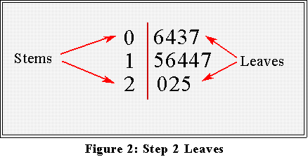
- Interpretation: most of the rates are in the teens, with about the same
number above and below.
- Admittedly, this graph doesn't reveal much that is already obvious from the
table, except perhaps that the "average" rate is somewhere in the teens. But
we will improve on this figure in a moment.
- A more detailed example:
- For now, consider a "batch" of numbers such as the figures on abortion
rates in the United States in 1982:
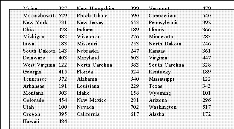
- The data are taken from Table 103 of The Statistical Abstract of the United
States, 1987 and represent the number of abortions per 1,000 live births.
- Note that they are not comparable with the Canadian data because the rates
are per 1,000 live births, not per 100. But we could adjust them by dividing
by 10. (I don't do so because I just want to illustrate stem-and-leaf
displays.)
- Let's construct a display for this batch.
- Most of the numbers begin with 1, 2, 3, 4,...etc. as in 327, 399, 479. So, as
before, let the stems be the digits 1, 2, 3,...etc.
- Write them down the side of piece of paper and draw a vertical line.
- Next, look at each number in the batch. Ignore the last digit and
concentrate on the second. (The first number is 327 so ignore the 7 and
look at the 2 which is the leaf part of this number. The 3 is the stem part.)
Locate the appropriate row (i.e., stem) and record (to the right of the line)
the digit that is the leaf. For example,
- In this data set the units digits are dropped.
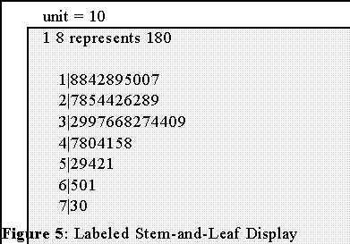
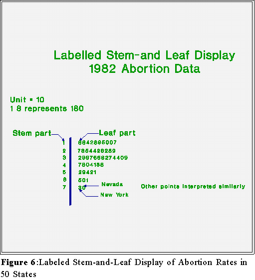
- Do this for all 50 states to get the display shown Figure 4.

- Interpretation: the numbers on the left are the stems--they are in this case the
hundreds digit--while the numbers on the right are the individual leaves--here they
represent tens. Thus, in the first row we see 1 and then and 8. This means one state
has an abortion rate of (approximately) 180. We also see another 8 on that row
meaning that another state has a rate of 180 (again approximately). Next is a 4
which means 140. All of the numbers are interpreted in this fashion.
- We can see at a glance that most of the states have abortion rates of about
100 or 200 or 300 abortions (per 1,000 live births).
- The "typical" rate seems to be about the high 200's or low 300's
- Only a few states are at the "high" end of the scale.
- The shape of the batch or distribution is "skewed" slightly.
- Skewed means the numbers tend to pile up at one end of the scale
or the other. In this example, there many states at the lower end of
the scale and few at the upper end. This is an important feature of
the data.
- In a stem-and-leaf display decimals are lost so the finished version should indicate
the decimal value of the leaves. For example, in the display
1|8
means 180, not 18 or 1800. Similarly,
7|3
means 730. Thus, the leaves are really multiples of ten, not 1.
- To indicate this say "unit = 10" and give an example. Figure 5 is an example of a
labeled stem-and-leaf display:
- Figure 6 shows the finished stem-and-leaf display with some annotation added.
- Note: don't you add the annotation. Use the format in Figure 5.
- A REFINEMENT:
- The display of Canadian abortion rates was not especially precise or informative
mainly because there were only 3 stems. If there had been many more data points,
the leaves would have stretched across the page.
- So we should perhaps redesign the figure.
- We can use in addition to digits other symbols to create more precise stems.
- Define the following stem codes:
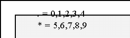
- That is we can use digits in combination with "." and "*" to define stems:
- 1. will have leaves from 0 through 4 where as 1* will have them
from 5 through 9.
- Consequently, 14.2 goes on the 1. line, whereas 16.6 is on the 1*
line. See Figure 7.
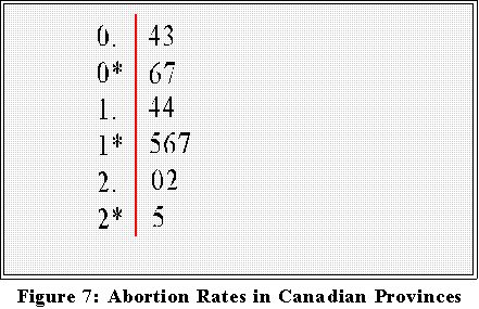
- This gives us slightly more detail: The "typical" rate is about 15 or 16,
there is large, "outlying" value, 25, and a couple of relatively small ones, 3
and 4.
- Note that when constructing a stem-and-leaf display by hand one records
the leaves as they appear in the data. Therefore, the first stem line is written
0.43, not 0.34. The 4 occurred first in the table.
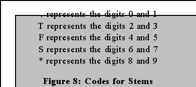
- To see how rapidly one can construct a stem-and-leaf display let consider a more
"realistic" example. See infant mortality and crime rates
for various cities in the United States.
- We'll graph the data in class by hand since this technique is meant to be an
analytic tool and is not intended for formal presentation.
- Here, however, it will be convenient to use additional symbols in the stem
parts of the display:
- NEXT TIME:
- Additional examples of stem-and-leaf displays and ways that one can calculate
descriptive statistics from these graphs.
 Go to Statistics main page
Go
to H. T. Reynolds page.
Copyright © 1997 H. T. Reynolds