DEPARTMENT OF POLITICAL SCIENCE
AND
INTERNATIONAL AFFAIRS
Posc/Uapp 815
BUILDING REGRESSION MODELS

- AGENDA:
- Review of previous examples
- Model building
- Time series and intervention analysis
- Reading:
- Agresti and Finlay, Statistical Methods, Chapter 10, pages 356 to 371
- PREVIOUS EXAMPLES:
- See the notes for Class 20.
- Population growth.
- Public expenditures data.
- Multiple variable case.
- Add independent variables to the list of factors or predictors.
- One can and should obtain residual plots. Do so in the same way as before: use
plotting options or store residuals and fitted values and then plot them.
- MODEL BUILDING:
- Problem: suppose we want to study the effects of pollution on health, and in
particular on mortality.
- Goal: find what effects pollution have on mortality after taking into
account social-economic status and living conditions.
- For this study we'll have to rely on "aggregate" data.
- The units of analysis are American metropolitan areas
- Data: the data we'll use come from McDonald, G.C. and Schwing, R.C. (1973)
"Instabilities of Regression Estimates Relating Air Pollution to Mortality",
Technometrics, vol.15, 463-482.
- I obtained them from the
"Statistic Library"
at Carnegie Mellon University in
the
data section
of the Journal of the American Statistical Association
(JAMA). (See the course web site.)
- Data
- The number of cases is 60 American metropolitan areas
- Variables:
- Average annual precipitation in inches (c1)
- Average January temperature in degrees F (c2)
- Same for July (c3)
- % of 1960 SMSA population aged 65 or older (c4)
- Average household size (c5)
- Median school years completed by those over 22 (c6)
- % of housing units which are sound & with all facilities (c7)
- Population per sq. mile in urbanized areas, 1960 (c8)
- % non-white population in urbanized areas, 1960 (c9)
- % employed in white collar occupations (c10)
- % of families with income less than $3000 (c11)
- Relative hydrocarbon pollution potential (c12)
- Same for nitric oxides (c13)
- Same for sulphur dioxide (c14)
- Annual average % relative humidity at 1pm (c15)
- Total age-adjusted mortality rate per 100,000 (c16)
- We can't use all of these variables for this example.
- A "modeling" strategy: since we have so much data we need a plan.
- For this example we'll restrict the analysis to a subset of variables divided
as follows:
- Pollution indicators (hydrocarbons, nitric oxide, and sulphur)
- Social and economic factors: percent of the population that is poor
and median school years completed.
- Discrimination (percent of population non-white).
- We would use a "theory" to select these variables. That is, we
wouldn't add them to our model simply because they came with the
data set.
- For example, we might hypothesize the non-white residents
would be less healthy because of lack of access to health
care, nutrition, and so forth.
- First, we need to examine the distributions.
- We want to "deal with" variables that are skewed or have outliers.
- Using descriptive statistics (such as comparing means and medians)
and stem-and-leaf plots we find that all of the pollution variables are
skewed to the right with several outliers.
- A quick glance at bivariate plots of the dependent variable,
mortality, against hydrocarbons or sulphur makes the need
for transformation apparent.
- See the previous notes regarding outliers.
- One way to make these variables more symmetric is to
transform them with the natural logarithm (the log to the
base e).
- You've already done this for other variables.
- Doing so does in fact make them more symmetric.
- Let's also see if their are patterns of correlations between the variables.
- Example: correlations of mortality with social and economic factors
and discrimination:
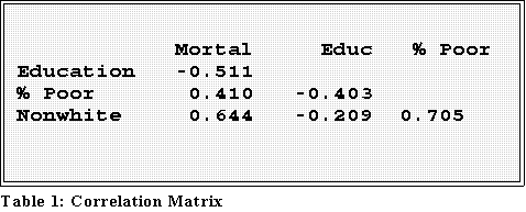
- We can see that mortality rate is negatively correlated with education and
positively related to both poverty and discrimination.
- What does this mean?
- Example: the higher the median years of education, which is a
measure of well being, the lower the mortality rate. Makes sense,
right?
- Here are the correlations of mortality with the pollution indexes:
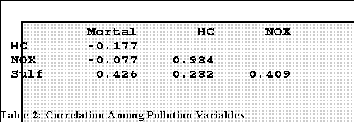
- Notice that the relationships are rather weak. Plots between Y
(mortality) and the X's show why.
-
Multicolinearity:
- Important note the correlation between hydrocarbons and nitric
oxides: r = .984
- This suggests among other things that two of the predictors are
themselves highly correlated and that, in fact, they are most
"synonymous" or redundant.
- We'll have to do something. The most likely and easiest strategy is
to drop one of them from the analysis.
- When the variables are transformed by taking the logs we obtain stronger
correlations:
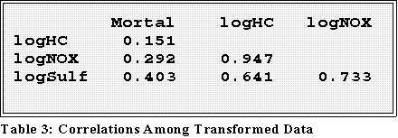
- Now the r's are a bit stronger. But note the multicolinearity
- We can later verify that using transformed variables improves the
analysis.
- Regression analysis:
- Let's first regress the dependent variable against the pollution indicators:
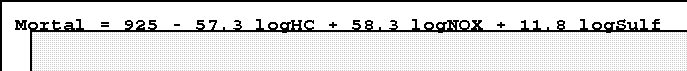
- Note that these are partial regression coefficients.
- 11.8 means, for example, that as "log sulphur" rate
increases by one unit, mortality increases by 11.8 per
100,000 population, after the other pollutants have been
held constant.
- This suggests that each type of pollutant has an effect.
- Yes the coefficient for log hydrocarbons is negative. That's
probably because it's so highly related to nitric oxides: the
hydrocarbon and nitric oxide emissions r is .97, an almost
perfect correlation.
- We can and thus should remove one of these indicators and will do
so later. But for now let's just add other variables.
- First note this model fits the data moderately well: R2 is .275.
- An aside: when using the untransformed variables the fit is slightly
better, R2 = .341. But this may be misleadingly high since there are
several outliers that may be making the relationship seem stronger
than it perhaps is.
- Now lets add the social and economic measures:

- Again we have partial regression coefficients. The partial betas pertaining
to nitric oxides and hydrocarbons have changed substantially, suggesting
that the multicolinearity is causing the estimates to be "unstable."
- The addition of these variables increases R2 to .483.
- Other indicators suggest an improvement in fit as we'll discuss in
class.
- Now let's add the discrimination variable, percent non-white.
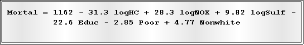
- The fit for this model is quite good, R2 = .682. Other statistics and
indicators also suggest the fit is solid.
- Eliminating redundancy between hydrocarbons and nitric oxides:
- The last model includes 6 independent variables. Do we need them all?
- It turns out that further analysis reveals that we can "explain" mortality
with just one pollution variable along with education and percent non-white:
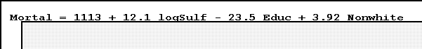
- The multiple correlation (R2) is
.642, only slightly lower than the previous
one.
- We can and perhaps will further improve this model. For now keep several points
in mind.
- Model building is an "interaction" between substantive theory and data
analysis.
- One has to proceed systematically and carefully.
- At each step check the tenability of assumptions.
- Realize that various fits are possible. Each has to be justified on its own
terms.
- INTERVENTION ANALYSIS:
- Suppose the Department of Public
Safety wants to investigate a "neighborhood"
watch program's effects on crime rates.
- It has collected information on the crime in an area of Chicago both before
and after the start of the program.
- The data
are the monthly number of burglaries.
- c1 is Burglary rate
- c2 is a "dummy variable":
- X = 0 for time periods before intervention
- X = 1 for data points after the intervention.
- The Department wants to know how effective the watch program has been.
- This problem represents a common type of analysis called "intervention analysis."
- There is a time series; that is, measurement collected on (equally spaced)
time intervals such as months or years.
- At some point an "intervention"--the adoption of a policy, program, or law
for example--"interrupts" the series.
- The diagram (Figure 1) provides an illustration.
- Note that an intervention can any of several possible consequences.
-
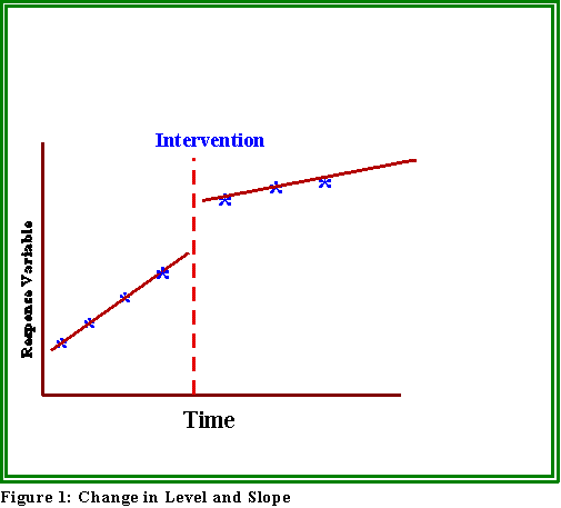 It can, as in Figure 1, change the "level" and/or rate of change ("slope") of
a series.
It can, as in Figure 1, change the "level" and/or rate of change ("slope") of
a series.
- For example, one might hypothesize that the rate of burglaries will
slow down or even decline after the institution of the watch
program.
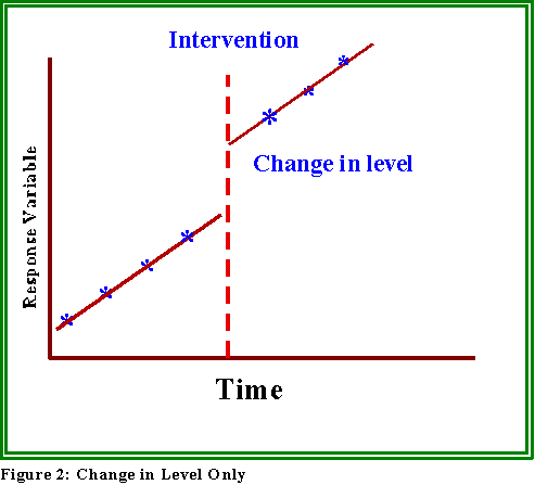
- It's possible that just the level will change, not the rate or slope of the
series. (See Figure 2 below.)
- Or, the slope or rate of the series can change as in Figure 3.
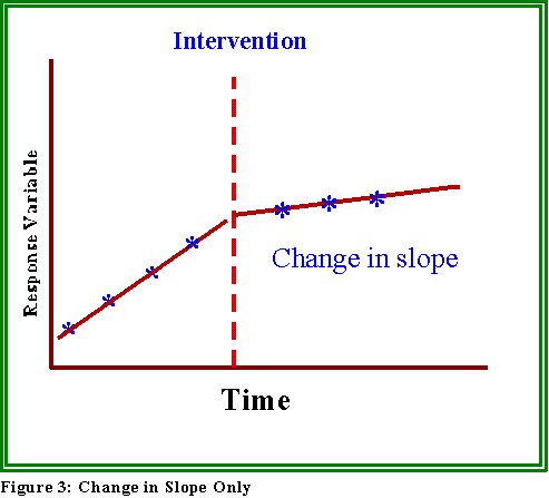
- Each of these possibilities has different policy implications.
- A MODEL TO INVESTIGATE THESE POSSIBILITIES:
- We can use regression analysis to determine which, if any of these, is appropriate
for the data.
- The dependent variable is measured at different time periods.
- Hence time is in a sense the unit of analysis.
- If the measurements have been made at N times, then the series consists of
N time periods.
- In the present example (the one pertaining to neighborhood watch) there
are 78 data points, some of which pertain to the months before the
program started, some of which pertained to the period after.
- Time series plot:
- Most programs such as MINITAB have a time series plot that can be used
to plot the data points. MINITAB automatically creates an indicator
variable.
- See the attached plot for an example.
- Dummy coding.
- Now, suppose we create a variable, X, with the following numeric codes or
values:
- X = 0 for time periods before the intervention and X = 1 for
periods or post intervention measures.
- We can use this variable as the independent factor in a simple regression model.

- Interpretation:
- We could use the standard definition or conceptualization of the regression
coefficient to make sense of the terms in this model.
- A one unit change in X leads
to a b1 unit change in Y, with
b1 being
measured in units of the dependent variable.
- But what is a one unit change in X. Here it represents a change
from "before" the intervention to "after."
- That is, those units (i.e., time periods) that have "scores" of 0 are
the ones that occur before the initiation of the neighborhood watch
program, and those that are coded 1 have the after units.
- Consequently if a "unit" "could" jump from before the intervention
to after, the effect on the burglary rate would be
b1.
- Example: the estimated equation for these data (using simple OLS with the
intervention variable scored 0 and 1 being treated as the independent factor) is:

- Interpretation:
- A change from "before" to "after" leads to 3.78 decrease in
monthly burglaries, on average.
- Another view point:
- Since there are only two values for X (0 and 1), why not substitute each of
them in the equation to see what results?
- First, here is the equation for the before "data points; that is the ones
scored 0:
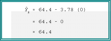
- We see that the predicted (or expected) burglary rate before the
intervention is 64.4.
- Now what about after? Well, the units are now coded 1, so the equation
becomes.
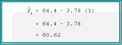
- The predicted or expected rate after is now 60.4 or 3.78 fewer burglaries
than previously.
- The analysis suggests that the intervention had an effect--the regression coefficient
was not zero--and the effect was to decrease crime--the sign of the coefficient is
negative.
- It turns out, however, that the model doesn't fit the data very well in the
sense that this observed effect could just be a "chance" or random
phenomenon. We would need more evidence before concluding definitively
that the program works.
- Moreover, we can add a couple of terms to model changes in level as well
as rate.
- We'll see more examples next time.
- NEXT TIME:
- Some more examples of intervention
- Statistical estimation and inference.
 Go to Statistics main page
Go
to H. T. Reynolds page.
Copyright © 1997 H. T. Reynolds