DEPARTMENT OF POLITICAL SCIENCE
AND
INTERNATIONAL AFFAIRS
Posc/Uaap 815
CORRELATION AND CAUSATION

- AGENDA:
- Explaining variation in a quantitative dependent variable with a quantitative
independent variable.
- Scatter or Bivariate plots
- Correlation
- Interpretation
- Correlation coefficient
- Reading: Agresti and Finlay, Statistical Methods Chapter 9, pages 301 to 307.
- Recommended: look over the material in the "Stat 438" course pertaining
to
scatterplots.
- Note: Some of this material goes far beyond what we will cover.
- For an interesting "story" that gives an example of a scatter plot go to:
- , at the
Data and Story Library
at Carnegie Mellon.
- For some remarks on "establishing cause and effect" see Bill Trochim's
Center for Social Research Methods
at
- All of these can be reached via the reserve room of the course web site.
- TYPES OF EXPLANATION:
- Analysis of variance:
- The purpose of ANOVA is to develop a mathematical model that shows
the relationship between X, a categorical independent variable, and Y. If
such a relationship exists, the means of various sub-populations will differ,
as illustrated in a previous class. ANOVA attempts to specify the exact
nature and strength of these differences.
- Seen from one perspective, if populations mean differ some of the variation
in Y will be attributable to the independent (or explanatory or predictor)
variable that specifies the different populations. The rest of the variation in
Y is attributed to other variables and random error, as the attached figure
(Figure 1 at end) illustrates.
- That is, consider X = political ideology. Think of individuals as
belonging to sub-populations described by the categories of
ideology (e.g., the sub-population of liberals, of moderates, etc.).
The differences in the sub-population means of the dependent
variable (attitudes toward Jesse Jackson, for instance) contribute to
the overall variation of opinions toward Reverend Jackson.
- Correlation and Regression:
- The objective of correlation and regression analysis is essentially the same
except that the independent variable need not be categorical. In fact,
ANOVA can be interpreted as a kind of or "subset" of regression analysis.
Both try to explain variation in Y, the dependent variable, in terms of one
or more independent variables.
- The ideas are perhaps best explained with an example.
- EXAMPLE - THE COST OF HEALTH CARE:
- Here is a quote from a recent New York Times article (X/26/93):
The fundamental laws of the marketplace is that of supply and demand. When the
supply of a product exceeds the demand for it, the price should fall. This is the
main reason peanut butter costs less than caviar.
But that law does not apply to medicine...Studies have repeatedly shown that the
level of use of hospital beds in a community is determined largely by how many
beds the community has...In the same vein, Dr. John E. Wennberg...found a
correlation between the number of surgeons in a community and the number of
operations performed there. (p. D22)
- What does the passage assert? We can distinguish two general claims:
- A variable (hospital use, for example) is associated with another
(the number of hospitals)
- A variable (e.g., number of hospitals) causes variation in another
(e.g., hospital use).
- The first claim can be investigated with the help of the statistical tools
described below and elsewhere. The second, a more "demanding"
assertion, raises all sorts of interesting philosophical issues but (in my view)
can not be established by any statistical procedure, although statistics may
or may not be relevant to the process of making causal inferences.
- More specifically, the passage asserts that we will observe a relationship or
correlation or association (I will be more precise later) between 1) hospital
use and 2) number of hospitals in a community and 3) the frequency of
operations and the number of surgeons in an area.
- Correlation and regression analysis helps us look for and describe these
connections.
- We will look first at correlation by examining plots.
- Using a readily available reference (Health Care State Rankings 1993,
Morgan Quinto Press), I looked first at these variables measured at the
state level:
- Average Stay in Community Hospitals, 1990 measured in days.
(Y1)
- Hospital beds per 100,000 population in 1990. (X1)
- Admissions to community hospitals per capita, 1990. (Y2)
- Scatterplots: perhaps the best way to examine the relationship between these
variables (to see how the values of one are related to the values of another) is to
construct a scatterplot or scattergram or (for short) plot.
- The values of the independent variable are arrayed along the X-axis
(horizontal) of a graph, those of the dependent variable along the vertical
or Y-axis.
- The X and Y values of each observation (in this case, each state) are
plotted on this coordinate system.
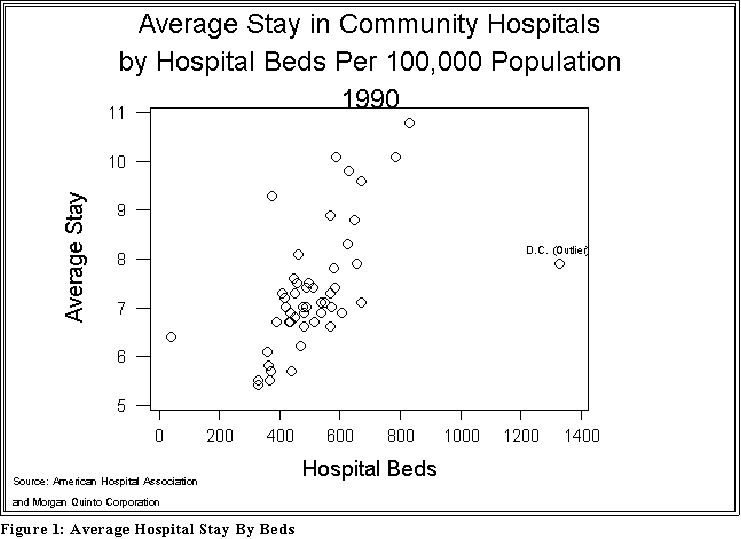
- If, for example, a state (e.g., South Dakota) has Y = 10.8 days per
stay and X = 780 hospitals beds per 100,000 population, we would
mark an "o" (say) at the intersection of 10.8 and 780.
- See Figure 1 below
- We would mark the circles (o) for each of the units to create a
"scatterplot." The plot graphically shows how the values of Y and
X are related (if, in fact, they are).
- Figure 1 (on the next page shows) shows an example.
- Interpretation: notice that as the number of hospital beds (per 100,000)
increases, the length of hospital stay also increases.
- As the figures presented later on suggest, this pattern indicates a
positive correlation between Y and X.
- Note, also that the relationship is not perfect in the sense that some
states with relatively "high" values of X have lower values of Y
than other states. But in general, we can say: the greater the X, the
greater the Y.
- In this sense, the data support or are consistent with the article's
main assertion.
- A scatterplot like the one shown in the figure is a very helpful first step in
correlation analysis.
- Correlation, as we will see, is a measure of how well a data set "fit a linear model."
Stated more simply, a correlation coefficient indicates how closely the points in a
scattergram lie to a straight line.
- Figures later on make the point even clearer.
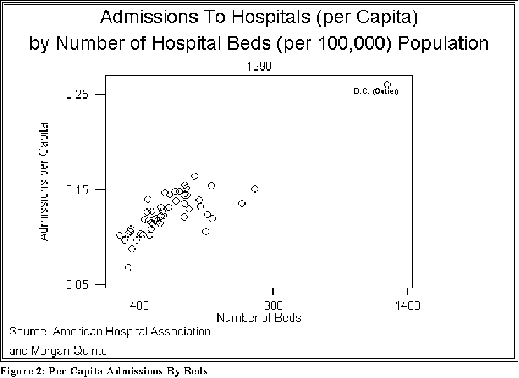
- Here is another example of a scatterplot, this time between the number of beds
(X1) and the admission rate (Y2). See Figure 2 below.
- Interpretation: once again the assertion in the Times article seems to hold
water: as the number of beds in a state increases, so too does the number
of admissions.
- Notice also that there is another "extreme" (outlying) point. We will have
to adjust the data to take it into account.
- INTERPRETING PLOTS:
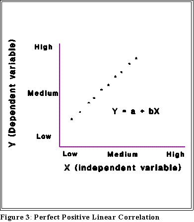
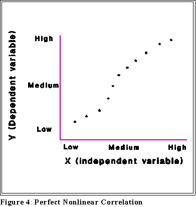
- The following pages show some different plots and their interpretation:
- Notice that some of these figures contain equations. Their meaning will be
explained later.
- For now we want to associate a picture with an interpretation.
- The interpretation of these plots rests on this notion of correlation, a term I am
now going to use with a particular meaning.
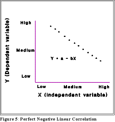
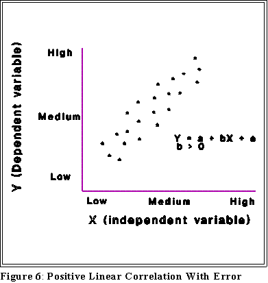
- Positive correlation: high values of Y are associated with high values
of X and, conversely, low values of Y are associated with low values of
X.
- Negative correlation: high values of Y are associated with low values
of X and, conversely, low values of Y are associated with high values
of X.
- For another example of positive non-perfect correlation see the "Smoking and
Lung Cancer" Story at
- http://lib.stat.cmu.edu/DASL/Stories/SmokingandCancer.html
- Note that correlation does not imply causation.
- MINITAB:
- Bivariate or scatterplots are produced in MINITAB and SPSS with the Graphics,
Plot menu and dialogue box.
- As with box plots make sure that the independent variable appears in the Y
list and the independent variable under X.
- Use the same options and annotation options as used with box plots.
- CAUSATION AND CAUSAL ANALYSIS:
- Some caveats in interpreting X-Y relationships:
- Causation: Nothing entitles us to assert a causal relationship between X
and Y, even if we find a strong relationship.
- Causation is a matter of inference, not statistics.
- "Spurious" correlation: X and Y may be related because of a third variable,
Z:
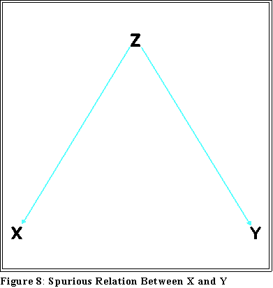
- Consider the
"Crime Story"
at Data and Story Library at Carnegie Mellon
- The author notes that the relationship between education and crime
appears to be positive (i.e., there is a positive correlation), which
contradicts commonsense.
- When two variables are positively or negatively correlated
it's important to
- think carefully about cause and effect
- consider alternative explanations such as "hidden or
lurking variables."
- Ecological inferences: Much of the data analyzed so far involves geographical
units--counties, states, and countries for example--but the statements apply to
individuals. Ideally, if one wants to make assertions about individuals, then
"individual-level" data should be collected.
- Be careful, in other words, about saying poverty "causes" illegitimacy (see
below) when the data supporting the statement pertain to states, not
individuals.
- Having said this, however, sometimes aggregate data (e.g., states) are the
only feasible information and interpretations based on them may be
reasonable.
- The point is simply to be modest and cautious in making claims.
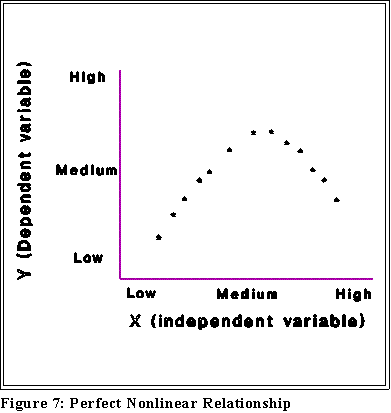
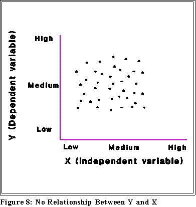
- Types of relationships
- Be careful in the use of language and thinking: two variables, X and Y,
may be related to some degree.
- Correlation is a special kind of relationship and a "linear" relationship is a
special kind of correlation. To say that two variables are not linearly related
does not mean that they are not related in some fashion. (See below)
- We look for linear relationships because they provide simple and easily
understood connections between X and Y. But if the relationship is not
linear it may still be associated some other way.
- Asymmetry:
- Treating Y as the dependent variable is very much different from treating X
as the dependent variable.
- Do not mix up dependent and independent variables; you get different
results in general when Y is dependent.
- Sometimes you will not know which variable is dependent. It is a statement
about your level of knowledge or the level of knowledge in the discipline
when the dependent variable is arbitrary.
- NEXT TIME:
- Regression, and correlation.
 Go to Statistics main page
Go
to H. T. Reynolds page.
Copyright © 1997 H. T. Reynolds