DEPARTMENT OF POLITICAL SCIENCE
AND
INTERNATIONAL RELATIONS
EXPLAINING VARIATION AND ANALYSIS OF
VARIANCE

- AGENDA:
- Touring the net and obtaining data
- The idea of "explained" variation
- Analysis of variance
- Using box plots to compare
measures of central tendency and dispersion
among different populations.
- Examples of explanation with box plots.
- SOURCES OF STATISTICAL INFORMATION AND DATA:
- The course internet site contains an information page that leads to some interesting
data sources,
statistical resources, and learning tools. We'll briefly visit some of
them if we can connect.
-
Carneige Mellon Statistics Library
-
"Math 438":
a set of materials on statistical graphics
- STATISTICAL EXPLANATION:
- As noted before
(see most recently the notes for Class 14), the variation of
quantitative variable
is usefully summarized by the total sum of squares:
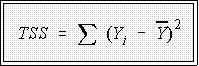
- Note that this concept of variation measures differences around a
mean,
 .
.
- Statistical explanation can be viewed from two perspectives:
- The numerical quantity, TSS, is partitioned into parts, an explained
by independent variables portion and an unexplained or error part.
- But explanation also involves comparisons among measures of
central tendency such as the mean or median.
- As an example, some of the total variation in Y may be "due
to" the fact that some units belong to a group that has a
different average value on Y than members of other groups.
- This idea is best illustrated with an example.
- EXAMPLE OF "EXPLAINING VARIATION":
- Consider these data pertaining to median weekly earnings of various occupational
groups. The analysis of these numbers has several purposes.
- First, it shows how tabular data can be summarized.
- More to the point, it illustrates how variation in a variable, here wages, can
be partially explained by introducing another variable, here gender.
- The following table shows a portion of the data.
| OCCUPATION |
MALE |
FEMALE |
| Administrators |
617 |
476 |
| Financial |
788 |
487 |
| Personnel |
785 |
563 |
| Purchasing |
709 |
- |
| Marketing |
814 |
503 |
| Education |
757 |
449 |
| Health |
743 |
535 |
| Real Estate |
516 |
355 |
| Other |
610 |
426 |
| Engineers |
727 |
624 |
| Math & Computer |
733 |
575 |
| Natural Scientists |
677 |
540 |
| Health |
807 |
553 |
| Health Treatment |
591 |
511 |
| College Teachers |
752 |
555 |
| Teachers |
560 |
463 |
| Counselors |
599 |
522 |
| Library |
- |
463 |
| Social Scientists |
676 |
531 |
| Social Workers |
414 |
395 |
| Lawyers |
930 |
765 |
| Writers & Entertainers |
559 |
388 |
-
The summary statistics for these data as a whole are:
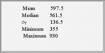
- That is, these numbers represent the mean, median, and so forth for all of
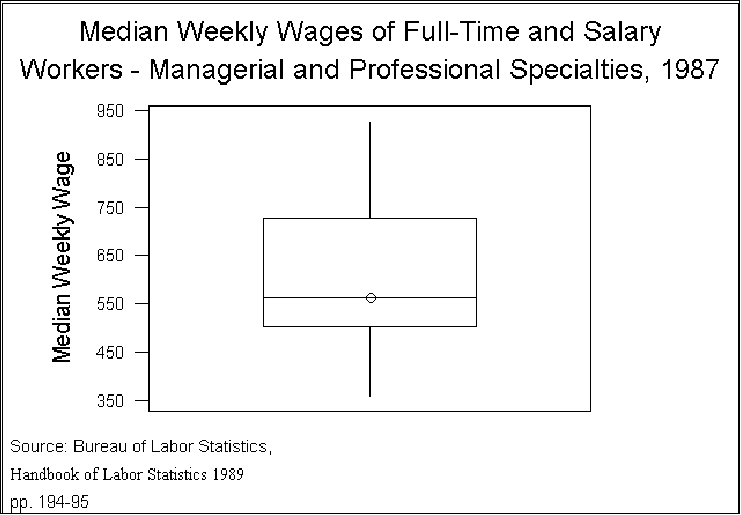
the categories regardless of gender. Figure 1 shows the distribution, using
the familiar box plot.
- Some points to note:
- Analysis of variance works with the TSS. Think of this number as a
description of the data, just as, say, a number describes a person's height or
a county's percent vote for Perot.
- The exact number, although it does not have an intuitive interpretation,
simply describes the variation in Y (e.g., weekly wages).
- The social scientist's job is to explain this variation: if every occupational
category had the same weekly median earnings, TSS would equal 0. But
since it doesn't, one wonders what factors produce the variation, just as
one can wonder why one person is tall, another short, or why one county
gave Perot a substantial percent of its vote at the same time that others did
not.
- Explanations of the variation are obvious: different occupations command
different salaries and wages because they are perhaps worth more to
society or their workers are organized or...you can think of other
possibilities.
- Columns two and three, however, suggest another source of variation,
gender differences in pay: at every level women earn less than men.
- Figure 2 shows the point:
- Clearly, the average weekly earnings for women is less than for men. Here we use
the median to compare; traditional analysis of variance relies on the mean, but, as
we have, noted the mean is "sensitive" to extreme scores and so we will use the
median and pictures to help "explain" variation.
- In this instance, we would conclude that a substantial, but not total, part of
the variation in wages is due to gender differences in pay.
- As an aside, think about how you would interpret Figure 2.
- Is there evidence of discrimination? Suppose that is your hypothesis. The
statistical equivalent is that the population measures of central tendency
differ. That is, think of males as comprising a subpopulation, females
another. In the analysis of variance case, the research hypothesis is
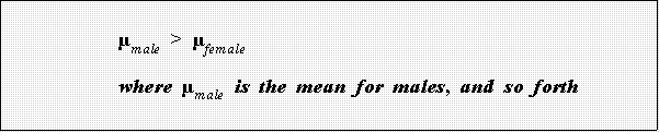
- Note: remember that a box plot displays medians so the above is
just a way to think about the two plots.
- It is clear that the data are consistent with this hypothesis or one cast in
terms of medians (as in Figure 2). A more important question is why do the
averages differ. That is, we have taken a first step toward explaining
variation in wages but it's not a very long first step. A more interesting
question is why do gender differences exist? Here are a couple of
possibilities that these data cannot address (but we could find other data to
sort them out):
- Sex discrimination
- Different work histories: men in each category have been employed
longer, have more experience, more education, and so forth.
- Can you think of other explanations.
- ANOTHER EXAMPLE OF STATISTICAL EXPLANATION:
- To see if sub-population or subgroup averages differ, we can use multiple box
plots. That is, we draw a box plot for the units in each category of the independent
variable.
- Here's another example:
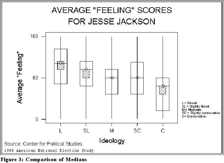
- Figure 3 on the next page perhaps shows how opinions of Jesse Jackson,
an American political and religious leader, differ by "ideology." In the past
Jackson has been very controversial in that some people respect him greatly
whereas others can't stand him.
- What explains the variation in opinions?
- Political ideology seems to be related as the Figure shows.
- We see that the more liberal a person is the more he or she rates
Jackson highly.
- STILL ANOTHER EXAMPLE:
- I obtained this example and data from the Data and Story Library at Carnegie
Mellon University's "StatLib" web site.
- It's a great place to visit and can be reached by clicking on sources of
information and links on the class internet site.
- N.M. Meltz, in "Interstate and Interprovincial Differences in Union Density,"
Industrial Relations, [28:2 (Spring 1989), 142-158.] wanted to explain variation
in the percentage of state employees belonging to labor unions.
- One variable he considered was "right to work" laws: some states make
union more difficult than others by enacting rules and regulations that
prevent people from being forced to join a union in order to work.
- Apparently Delaware does not have such a law.
- Common sense suggests that the presence of such laws, which perhaps
reflect an "anti-union" attitude among citizens, would be associated with
public union membership.
- This idea is easy to test as in the box plot in Figure 4.
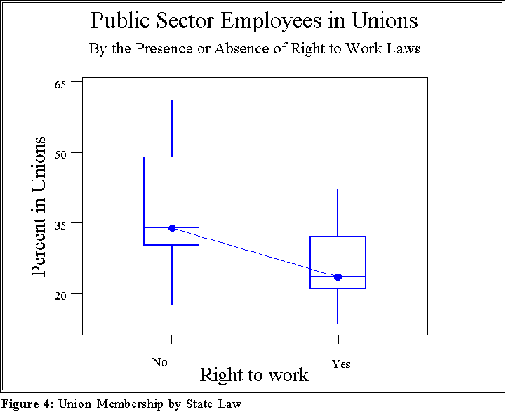
- This figure suggests that the presence of right to work laws affects the rate
or percentage of union membership.
- We'll discuss this sort of conclusion and its supporting evidence in
much more detail latter.
- The data are available on the web site.
- ANALYSIS OF VARIANCE:
- The sort of analysis conduct above represents an "analogue" of an important
statistical technique known as analysis of variance (ANOVA).
- The objective is to "explain" be reference to an independent variable(s) the
statistical variation in a dependent variable.
- There is, for instance, variation in union membership among the states.
- An investigator might suggest that this variation is due to
differences in public attitudes as reflected in laws.
- Of course, such a hypothesis assumes that laws reflect the
will of the people, a very controversial assumption to say
the least.
- In any event, ANOVA partitions the total variation (see the Section II,
above) into a part that is "explained by" or attributable to the independent
variable (e.g., presence or absence of right-to-work laws) and to random
error.
- We take up the statistical method in detail in the second semester of applied
statistics, but for now look at this equation:

- These sums of squares are just numbers. The total sum of squares
represents total variation in Y (see above), the "explained by..." sum of
squares is that part attributable to X, an independent variable while the
"error SS" represents what is unknown or unaccounted for or "left over"
after X has "done its work."
- For instance, suppose TSS = 100 and we find that
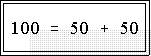
- In this instance we would say that X explains 50 percent of the variation in
Y and that the remaining 50 percent remains, for now, unexplained.
- Someone might add another variable, Z, in an attempt to reduce the
unexplained or error SS further.
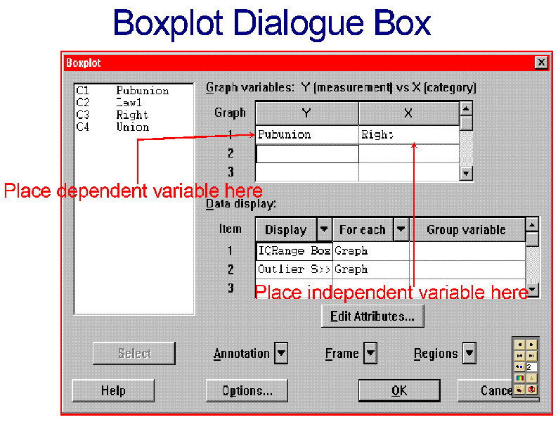
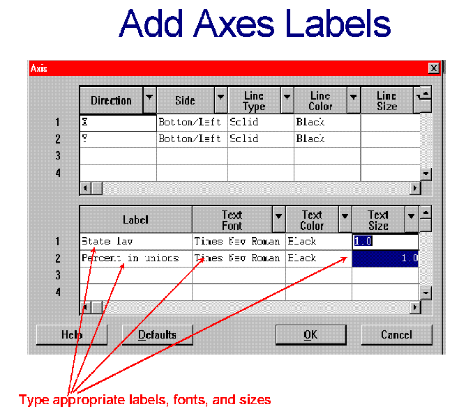
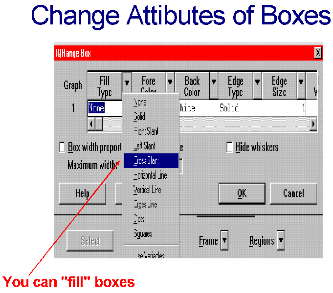
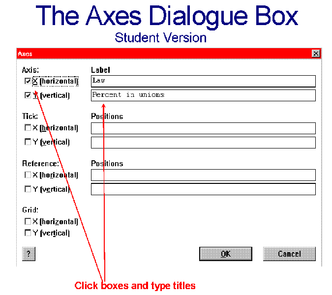
- CREATING PLOTS WITH MINITAB:
- You can create multiple box plots with MINITAB.
- But the independent variable must consist of a relatively small number of
numerical categories.
- In the example above states having no right-to-work laws were
coded or represented by "0" and those with such laws by "1."
- Hence, the independent variable here has just two categories.
- A common mistake is to attempt to create multiple plots with an
independent variable having a large number of categories or levels such as
more than 20.
-
See the attached figures for
information about annotating the plots.
- They will be demonstrated in class (I hope).
- For further examples and discussion go to:
Data Story and Library
-
This site, Carnegie Mellon University Statistics Department,
has a huge
web site that contains numerous examples and explanations not simply of
box plots but of all sorts of statistical methods. We
're going to be going
back in all likelihood.
.
- NEXT TIME:
- Correlation and causation.
 Go to Statistics main page
Go
to H. T. Reynolds page.
Copyright © 1997 H. T. Reynolds