DEPARTMENT OF POLITICAL SCIENCE
AND
INTERNATIONAL RELATIONS
Posc/Uapp 815
Time Series and Distributions

- CLASS 11 AGENDA:
- Time series
- Semi-logarithmic plots
- Intervention analysis and the interpretation of time series.
- Probability distributions
- The normal distribution.
- Reading:
- Agresti and Finlay, Statistical Methods, Chapter 4 pages 80 to 94.
- PLOTTING TIME SERIES TO EXAMINE CHANGE:
- Charles Murray a policy analyst and author of among many works The Bell Curve
has argued for years that America's system of public welfare has unintended,
indeed perverse effects. In an earlier book, Losing Ground, he claims, for
instance, that the welfare state has caused increases in "unwanted" or "undesirable"
behaviors and instead of helping the poor it has actually worsened their situation.
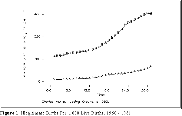
Figure 1 graph, indicative of the kinds of analysis Murray uses, seems to indicate
that 1) the rate of out-of-wedlock births among blacks has skyrocketed and that 2)
most of the change has occurred after 1970, the era when the welfare state began
to expand by leaps and bounds.
- Comparing changes.
- Using an arithmetic scale to compare rates of change, especially when the
time series have different numeric values, can sometimes be misleading.
Murray's figure suggests that the rate of increase among "Blacks and
Others" is greater than among whites. But since the first category starts at
a higher rate, it takes a larger numerical increase to match the percentage
change in a series with smaller values.
- Figure 1 on the next page shows change using raw data. This graph
is identical to the ones that appear in Losing Ground. It appears
that increase in illegitimacy is higher among blacks than whites,
especially after 1965.
- NOTE IN THESE FIGURES "B" REPRESENTS THE
ILLEGITIMACY RATE AMONG BLACKS, "A" THE RATE
AMONG WHITES.
- It has been suggested however, that one obtains a somewhat better picture of
change, especially when comparing two time series that start at different places,
one should first transform the dependent or series variable. Transforming each Y
by taking its logarithm sometimes leads to a different interpretation.
- Programing: either SPSS or MINITAB facilitate transformations. Simply
identify a column or variable, indicate how the numbers should be changed,
and store the results in a different column with a different name.
- In the student version of MINITAB use Calc,
then pick Mathematical
expressions.
- In the dialogue box first type a column in which the new variable
will be stored.
- In the expression box type loge (c1), assuming that column 1
contains the variable. Don't forget the parentheses around the
column number.
- "Loge" means the natural logarithm.
- Then press OK.
- Follow the same general instructions for the full version of MINITAB.
- If you are using SPSS go to
Transform menu and then select Calculate.
- As with MINITAB enter a name for the new variable, then in the
box enter the expression ln(variable name), where the name is the
label for the variable being transformed.
- Don't forget the parentheses and note that with SPSS the
key word is ln, note loge.
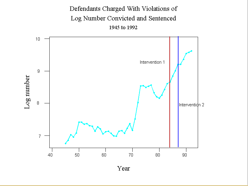
- Figure 2 shows the result when applied to Murray's data.
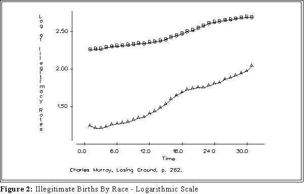
- Interpretation: the relative steepness of a slope or curve on a
semi-logarithmic graph indicates the rate of change of a variable across
time.
- A horizontal slope indicates no change.
- Positive (negative) slope indicates that a variable is increasing
(decreasing) over time.
- A straight line indicates a constant rate of change.
- The steeper the slope the greater the change.
- Two parallel lines or curves indicate the same rate of change.
- In this instance the rate of increase among whites appears to be greater
than among blacks. That difference is obscured by the graph of the raw
data because the starting places are so different.
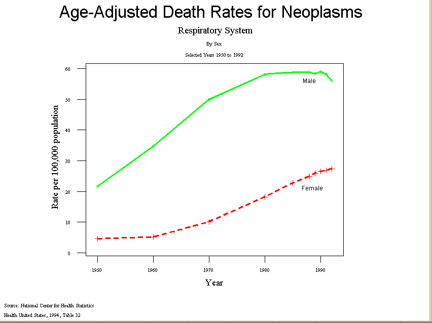
- Another example: increase in neoplasms of the respiratory system.
- Source: Center for Health Statistics, Health United States, 1994
- The raw rates start from such different bases that it is difficult to compare
the series.
- The first figure
compares white men and females in the
incidence of lung cancer since 1945.
- When looking at the raw rates it appears that the rate for men skyrocketed
after 1960 and then began to taper off about 1980. The increase for women
seems more modest and also levels off after 1980.
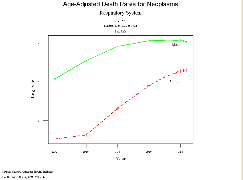
- But the log rates,
Figure 2,
shows that actually the rate for women accelerated after
1960, more than for men, and continued upward after 1980.
- Finally, another example.
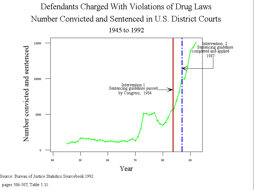
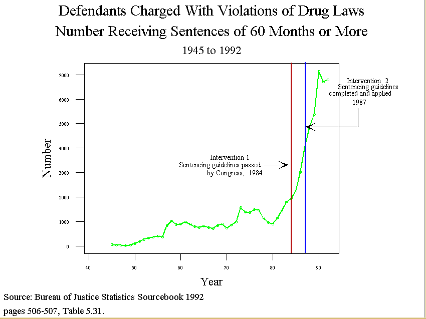
- Intervention analysis: frequently an investigator wants to know if there has
been a "change" in a time series that can be attributed to an "intervention"
such as the enactment of a law.
- In the early 1980s, for instance, Congress and the president began
pressing for tougher sentences for people convicted of violations of
drug laws. What was the result of this get tough policy?
- The Sentencing Reform Act of 1984 established a U.S.
Sentencing Commission, which made its first report and
recommendations to Congress in 1987.
- Number of Convictions
- Log number of convictions
- Number sentence to 60 more or months
- We see from the figures that imprisonment and number serving long
sentences increased dramatically in the 80s, but the increase
apparently began before 1984.
- Interpreting time series data.
- The causes (and even existence) of trends are not self-evident. Intervention
analysis can throw some light on possible causes, but it in no way can
"prove" causality.
- Moreover, it is easy to attribute a change in a series to some cause. But
keep in mind that many things are changing over time. So one factor may
or may not be responsible for the increase or decrease.
- This issue crops up in discussions of trends in crime rates. Lately the
incidence of both violent and non-violent crimes seem to be decreasing in
many areas of the country. Politicians of course like to take credit for the
declines by citing laws and regulations they have purportedly put on the
books. But here is a possible alternative explanation: as the crime rate has
decreased in the 1990s, so too has the number of young males as a portion
of the population. So perhaps that explains the decrease. Or perhaps it (the
decline) can be traced to improvements in the economy.
- The statistical aspects of these questions are taken up next semester.
- PROBABILITY DISTRIBUTIONS AGAIN:
- Suppose that we somehow know (we've asked everyone in a survey, for instance)
that 15 percent of the registered voters in a community support President Clinton's
stand on trade policy (that is, they favor expanding and liberalizing trade
agreements).
- Now suppose we ask some one to poll 7 registered voters and ask them whether
they agree with Clinton's position. This sample shows that 2 out of the 7 do
- A probability distribution can help us answer the following type of question:
- If the "true" or population percent (proportion) is 15% (or .15), how likely
is it that a survey of 7 respondents would turn up 2 or fewer individuals
who agree with Clinton?
- The distribution can help us answer the question because it shows for each
possible sample outcome (i.e., 0 respondents agree, 1 respondent agrees, 2
respondents agree, and so forth) the probability of obtaining that result,
given the true value is .15
- Here is a listing of all possible outcomes in a sample of 8 and the associated
probabilities of each of those outcomes:
- We can see, for example, that under the supposition or hypothesis that the
true proportion is .15, it is highly likely that 2 or fewer people would agree
with Clinton's.
- Again, a probability distribution associates the possible outcomes of an
"experiment" or sample with the probability of occurrence under a particular
hypothesis.
- More precisely, a probability distribution is a function: an input value (a
score on a variable, for example) is translated into a probability.
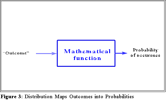
- Sometimes all of these scores and probabilities can be shown as a tabulated
distribution such as in the previous box.
- We can also interpret probability distributions graphically as below.
- NORMAL DISTRIBUTION:
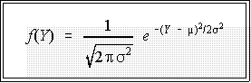
- A normal distribution is just one of many kinds of probability distributions. The
normal distribution is specified by an equation or function that contains two
constants or parameters, the mean, m,
and standard deviation, s.
- The normal distribution function looks like this:
- The graph of this equation is a bell shaped curve with midpoint or
mean at m.
- Here are some points that may help simplify the formula.
- e and p
are just positive constants or numbers.
- The working part of this equation is
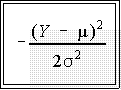
- The more Y differs from the mean, the larger the numerator in this
expression.
- Since the numerator is squared, Y values equal distant from m but
in opposite directions will lead to the same value for the exponent.
- That is, if the mean is 50, then Y scores of 40 and 60 will
produce the same value for

- Hence the distribution is symmetric.
- Moreover, the exponent has a negative sign, which means that the
larger the Y relative to the mean, the smaller the value of the
function. This fact indicates roughly speaking that values far from
the mean (in either direction) will have lower probability of
occurrence.
- It can also be seen from the formula that if the exponent of e is
zero, the function reduces to
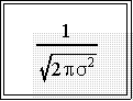
- This is largest value the function
can take and implies that
the distribution will be unimodal; that is, it will have
one and only one maximum value.
- Note that the exact shape of the normal distribution depends on the values
of the parameters m and s2. So it is a family of distributions.
- In general: the graph of the function is bell shaped and symmetric (i.e., one half
looks just like the other half): the mean, , divides the distribution into two equal
sized portions.
- Here is a picture or graph of the equation of the normal distribution:
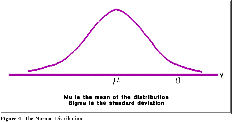
- The curve shown here is really a graph for the equation for the normal
distribution--the particulars of the equation are not important so we will
not consider them at this time.
- Properties:
- Notice that the curve depends on two parameters, the mean () and the
standard deviation (). The normal distribution is in a sense a family of
curves, each depending on a particular mean and standard deviation.
- The distribution is symmetric and bell shaped
- The mean, , marks the "center" of the distribution.
- The total area under the graph of the normal distribution equation is usually
interpreted as equaling 100% or 1.0, depending on whether one wants to
talk about a percent of an area under the curve or a proportion of the area
under the curve.
- Areas under the curve can also be interpreted as probabilities.
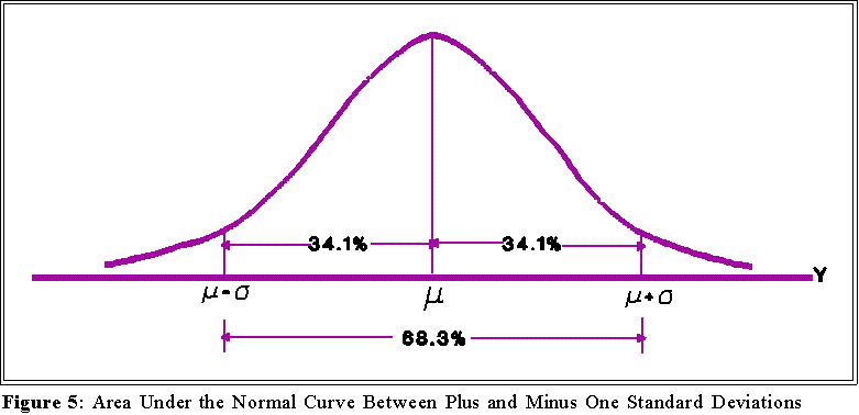
- The area within plus one and minus one standard deviation of the mean constitutes
about 68 percent of the area under the curve:
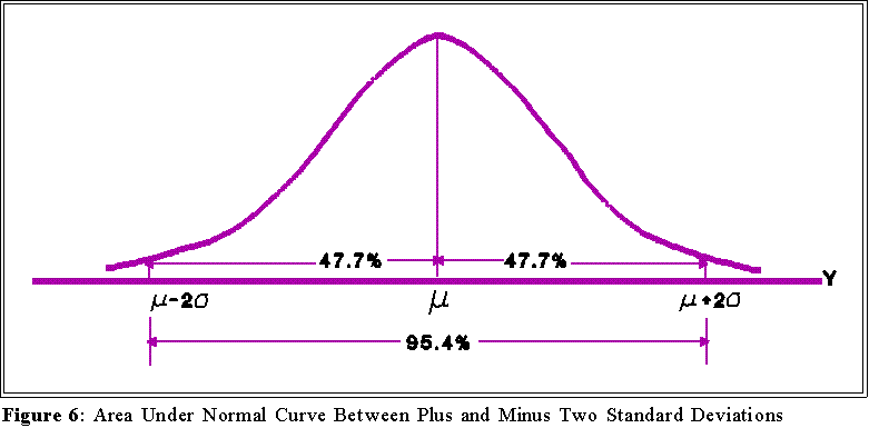
- The area within plus and minus two standard deviations of the mean
constitutes about 95 percent of the area under the curve:
- Hence, one can interpret the value of the standard deviation by reference to
the normal curve. If a variable is distributed normally, then approximately
two thirds of the population will lie (i.e., have scores) within plus or minus
one standard deviation of the mean; about 95 percent will be within plus or
minus 2 standard deviations of the mean. To see what this mean use
MINITAB to calculate the mean and standard deviation of a normally
distributed variable (use the stem command to see if the variable
approximates a normal distribution). Then add and subtract 1 standard
deviation to the mean. About two thirds of the cases should lie between
these numbers.
- USING AREAS UNDER THE CURVE TO ANSWER QUESTIONS:
- The last point raise interesting and important questions.
- How much of the area lies above three standard deviations from the mean?
- How much lies between 0 and +1.5 standard deviations?
- How many standard deviations above the mean marks the point which
encompasses 49 percent of the area?
- Here is a different question:
- Suppose one believes that a variable Y has a normal distribution with a
mean of 0 and a standard deviation of 10. An observation is drawn at
random from a population of Y values and its score turns out to be 50.
Does this observation (Y = 50) cast any doubt on the supposition. In other
words, does getting a value of 50 from a population that supposedly has a
mean value of 0 surprise you?
- We can't answer these questions without more information.
- NEXT TIME:
- The standard normal distribution
 Go to Statistics main page
Go
to H. T. Reynolds page.
Copyright © 1997 H. T. Reynolds