DEPARTMENT OF POLITICAL SCIENCE
AND
INTERNATIONAL RELATIONS
Posc/Uapp 815
More on Graphical and Numerical Summaries

- CLASS 10 AGENDA:
- Percentiles
- Frequency distributions and histograms
- Times Series
- More on measures of change
- Reading:
- Agresti and Finlay,
Statistical Methods for the Social Sciences, pages 36
to 40.
- PERCENTILES AND QUARTILES:
- See the notes for Class 9.
- FREQUENCY DISTRIBUTIONS AND HISTOGRAM:
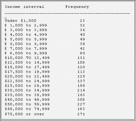
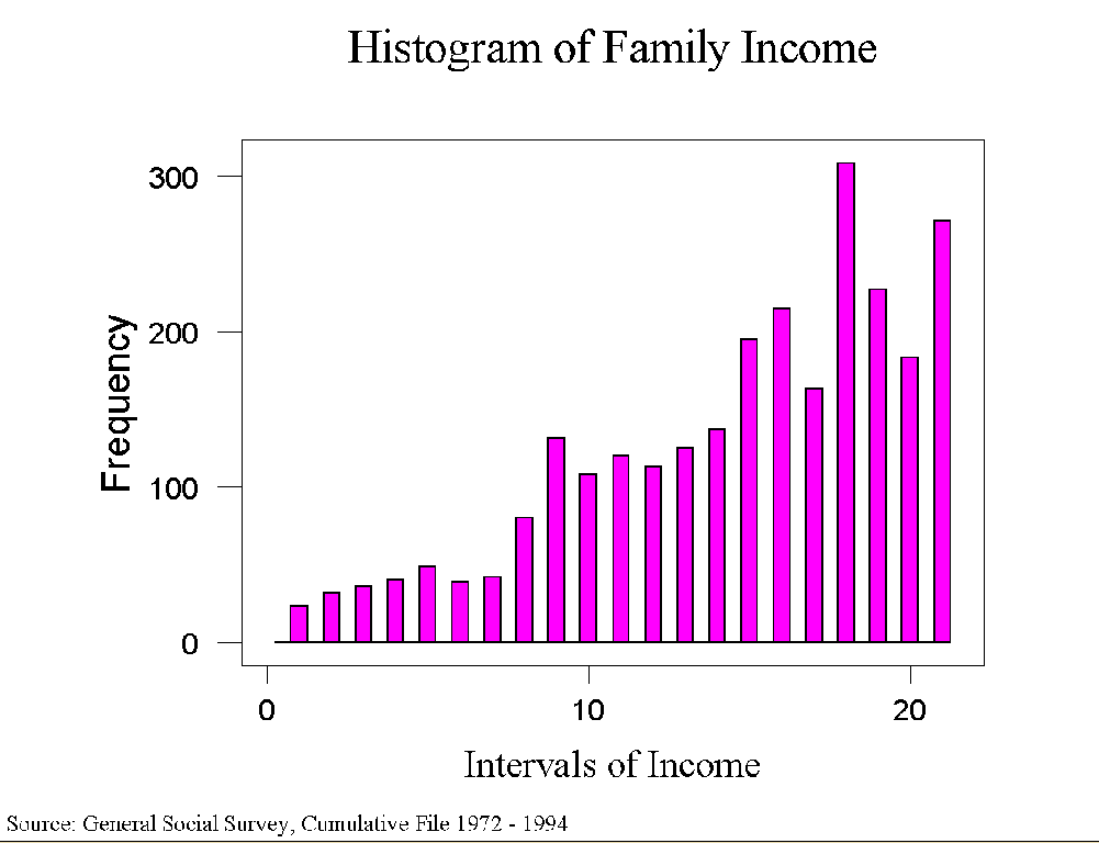
- Frequency distribution: as Agresti and Finlay note, a frequency distribution lists
intervals of a variable
and the number or frequency of cases (in the batch) in each
interval.
- Here is an
example drawn from the
General Social Survey, which incidentally
you looked at in Assignment 2.
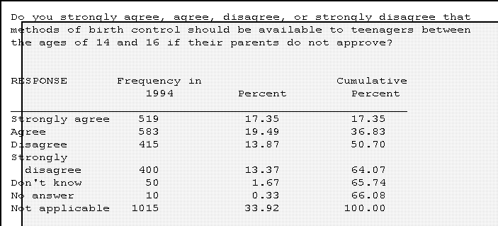
- "Self reported family income in 1994:
in which of these groups did your
total family income, from all sources,
fall last year before taxes, that is?"
- It might be helpful to summarize these data and display them in another
format.
- Percentages.
- It is usually helpful to have the percentages along with the raw figures.
- In this context a percent can be thought of as a relative frequency.
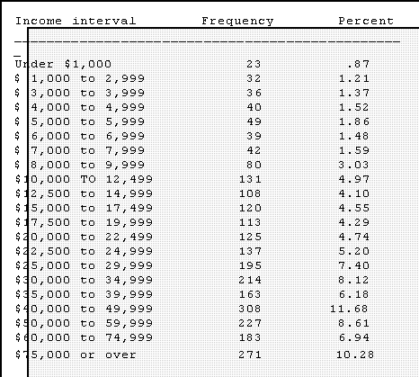
- Relative frequencies show the percent or proportion of the total
observations in the batch that fall in each interval.
- Cumulative frequencies and percentages
- It is sometimes helpful to know how many or what proportion of cases are
at or below a certain interval. These figures are cumulative frequencies and
percentages.
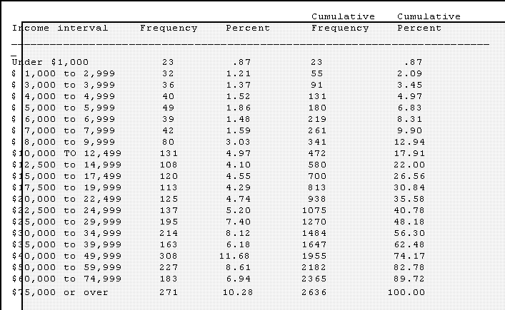
- Displayed in this format one can more or less easily calculate the mean,
median, hinges, and mode the most frequent interval.
- Mean - an approximation: find the midpoint of each interval and
multiply by the frequency. Add and divide this total.
- Median: Using the usual procedures find the depth of the median
and hinges, locate the appropriate rows or intervals and take the
midpoint of the interval as the value.
- Example: the depth of the median is

- Hence we average the value of the 1,318th and 3,319th
observations. Since they are in the $30,000 to $34,000
interval, we would look there. But the raw numbers are not
available, so let's assume that each case has an income equal
to the midpoint of that interval. The width of the interval is

- So the midpoint is half of 4,999 added to 30,000 or
$32,499.50.
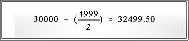
- This is of course only an approximation but it gives us a
rough idea of the average.
- More precise ways of calculating the mean from these so-called
grouped data are available, but we will not go into them since
computers usually mean that we don't have to group data in order
to calculate statistics on large batches of data.
- A frequency distribution can be used with any type of data, not just interval or
purely quantitative. Here is an entry from the General Social Survey.
- Usually one is only interested in the "substantive" responses so the
percentages are often calculated with the total number of meaningful
answers as the base. The "missing data," in other words, are deleted or
ignored.
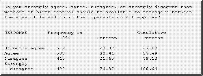
- This is an example of a uniform or rectangular distribution; note that there
are approximately equal number in the four substantive response
categories.
- Histogram:
- A histogram displays the relative frequencies of each interval.
- A type of bar chart it is constructed in such a manner that the area of the
bars is proportional to the proportion of the cases that fall into each
interval.
- Again since nearly every statistical program package draws histograms, we
will not go into the details here.
- A histogram serves many of the same purposes as a stem-and-leaf
display, and since the latter is easier to draw,
I generally rely on it.
- The attached graph
shows an example.
- MORE ON TIME SERIES DATA:
- As noted previously, time series consist of observations on one or more variables
collected at different time periods.
- Ideally, the time interval will be the same and equally spaced.
- Example: unemployment recorded monthly or yearly or temperature
recorded daily.
- A substantive problem
- Politicians commonly claim that the federal government has become too
large, inefficient, and intrusive to serve the needs of the people. They call
for major reductions in spending and cuts in the size of the bureaucracy.
- Suppose we wanted to examine this claim systematically.
- The data set
"Federal Government
Employment 1920 to 1985" on the web
page provides federal employment figures for past half a century. In
particular the variables are:
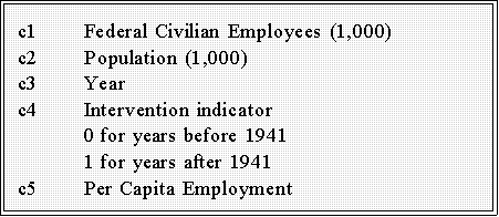
- The use of the intervention variable will be explained later in the
semester or next year.
- The reported data consist of five year intervals starting with 1920.
- For now consider how these data can be summarized and displayed.
- We could of course use a stem-and-leaf display to calculate hinges and the
median.
- But what the question really addresses growth and change. We want some
way to show growth.
- Percent change and log percent change are two obvious tools.
- Employment in 1920 was about 655,000 whereas by 1985 it
had grown to more than 2.9 million. According to the
standard percent change formula this represents a 343
percent increase.
- The log percent change, L%, is about 149%
- We might want to partition the total increase into the growth in various
periods.
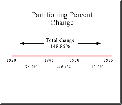
- We see that there was a huge increase between 1920 and 1945, due
to the war, a decrease and then more modest increase after 1960.
- The gross percent change is usually what is reported on the
campaign trail in order to dramatize the point. But even looking at
the post 1960 period we do see a substantial increase.
- But even these number might not tell the whole story and in fact could be
very misleading. So perhaps the data should be plotted as in the next figure.
- The plot can be constructed by treating Year as an independent
variable (X) and number of employees as Y or the dependent
variable.
- The dependent variable should be the vertical axis and X the
horizontal axis.
- Don't forget to multiply the number in the data set by 1,000
to get the full value. That is, there we 655,000 federal
employees in 1920, not 655.
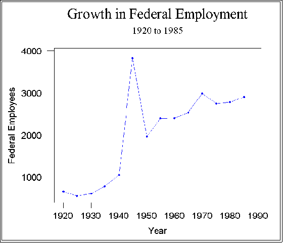
- This figure suggests that the critics might be right. Needless to say, World
War II saw a huge increase in public employment. The total dropped
considerably after the war but no where near the pre-war number.
Moreover, it appears that there has been a more or less steady increase
ever since.
- The problem with this interpretation is that Y variable is measured as the
"number of employees" without taking into account that the population has
grown over the years. Thus, when one talks about the size of the
government, it might be useful to measure it, not in absolute, but relative
terms. One way to do this is divided employment by population size. Doing
so makes year by year comparisons more useful, perhaps even valid. The
next figure shows the result of indexing federal employment by population
size to create a new variable, employment per capita.
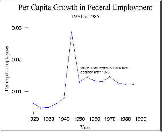
- The actual data values are not especially intuitively informative--less than a
tenth of an employee per person in 1920. But we are interested in trends
and patterns so the graph is helpful.
- It appears that after, say 1960, the time of the allegedly greatest liberal
influence, growth in federal government employment per capita actually
declined.
- Per capita employment seems to be a better indicator than the
"raw" employment rates because as time goes on the population
increases.
- On the other hand, it should be pointed out that state and local
governments have grown, partly in response to federal mandates.
So, this figure is not the entire story.
- NEXT TIME:
- In a week we will discuss
- Semi-logarithmic plots to show change.
- Smoothing
- The normal distribution
- Be sure to look at the announcements page of the web site.
 Go to Statistics main page
Go
to H. T. Reynolds page.
Copyright © 1997 H. T. Reynolds