About Profiles
Generic output files come with the Epson printers. These files instruct the printer about how to handle the files being sent to it and include things like the type of paper and inks you are using. These profiles, or that you download from Epson’s web site have been made to work with their products, which is why Epson recommends that you use only their papers and inks.
You can also use third party paper profiles. Many third party art paper manufacturers create their own printer profiles for their paper types. Some have been created to work with Epson inks or with third party art inks used in Epson printers. Professional print houses often have color profiles available for their customers to download and use when adjusting (soft proofing) their images for color printing to their printers. And, for a fee, there are even a number of businesses that will create custom profiles for your favorite papers and printer inks.
About Soft Proofing
Soft proofing is the ability to view a simulation of how your image will look when output to the printer on your monitor, based on the chosen profile. The workflow would go something like the following:
- You open a file, and choose a profile.
- After a profile and settings are chosen, you adjust the image to look best with that profile.
- Then you would use the save as command to save a profiled version of the image and still have a copy of your original file.
- Next, you would set the printer settings to allow Photoshop to print the image.
Or if sending to and using a professional print house profile, you would convert the image to the profile to send to your printer.
Using Soft Proof
To use soft proof, open your image in Photoshop,
1. Select View -> Proof Setup -> Custom.
The Proof Setup dialog box opens.
The Setup menu lets you load the Epson paper profiles that came with your printer or the custom created proofing files.
These files are stored in a folder on your computer. All of the saved setup files in this folder appear in the Proof Setup submenu. Custom profiles that YOU save appear at the bottom of the list.
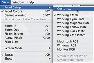
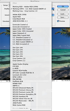
The Profile menu is where you choose the profile for the output that you want to simulate on your monitor. You can choose a profile for Epson papers, or other custom profiles like, RGB, CMYK, Color or Grayscale printer, monitors, etc.
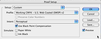
3. Select the Rendering Intent you will use when you print your image.
This is where you select the option for how the image should be simulated on screen--the conversion from document space to the proof space.
A rendering intent determines how a color management system handles color conversion from one color space to another. In other words, the Rendering intent is the method used to map the out-of-gamut colors of your image’s working space to the limited gamut of your printer, the chosen paper, and ink.
Photoshop will dynamically update your choices, enabling you see instantly how different intents will affect your image. The default intent is Perceptual, which works well for most photographic images. Sometimes, if your image doesn’t contain any colors that are out-of-gamut, Relative Colorimetric may be a better choice. It is important to test both options when doing your test printing.
The Rendering Intent Options
The two most recommended rendering intents for photographs are Perceptual and Relative Colorimetric. The one you choose depends on whether colors are critical in an image and on your preference for the image color appearance. They both handle the color information in different ways. As always, you should experiment with these options and keep good records. There are a number of good web sites that explain the whole process for how these intents render (replace) their colors.
Here are some web sites that may help you understand the process. If they’re no longer active, do a search, using rendering intents, lots of pages will come up.
http://www.newsandtech.com/issues/2004/03-04/pt/03-04_rendering.htm
http://www.creativepro.com/story/feature/12641.htmlPerceptual
Perceptual rendering intents use vendor specific information when converting colors, and they change from vender to vender. For example, Epson’s version of Perceptual may be different from Canon or HP. They are designed to produce attractive, more natural (to the human eye) results by allowing slight adjustments in the color values throughout the image. This is generally the option to choose when printing photos to desktop inkjet printers.
Relative Colorimetric
Relative colorimetric preserves more of the original colors in an image than Perceptual. It should be used when proofing for reproduction, or where color accuracy is essential. It is generally a good choice when using an inkjet printer to proof images that will be used for offset printing.
Note: You may prefer the results obtained when printing photographs to those from the more normally used Perceptual intent. So, be sure to test and keep recorders of your results
Saturation
This option tries to produce vivid color, not necessarily accurate ones. This intent is best used for business graphics like graphs or charts, where vivid colors are important.
Absolute Colorimetric
Suitable for proofing to simulate the output of a particular device.
White Paper
Simulate Paper White previews the specific shade of white of the print medium defined by a document's profile. This option is not available for all profiles and is available only for soft proofing, not printing. As we all know, some whites have a blue, pink, or yellow tone to them.
Black Ink
Simulate Black Ink previews the actual dynamic range defined by a document's profile. It turns off Black Point Compensation. The result is, the blacks appear lighter. This option is not available for all profiles and is available only for soft proofing, not printing.
Note: Do not check the box for Preserve Color NumbersPreserve Color Numbers simulates what would happen if you send an unconverted document to the output specified in your chosen Profile. This option is most useful when simulating how CMYK files prepared for one printing process will work on another. When Preserve Color Numbers is activated, other options become unavailable in the Intent menu. You are basically telling Photoshop you don't want to convert the image, and no rendering intent applies.Examples
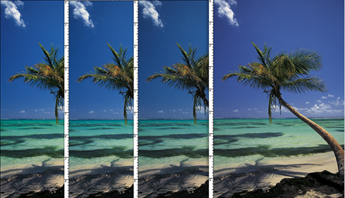
Here is an example of the same image duplicated four times. Each image is set to a different ICC file soft proof preview. As you can see, there is a difference in how the image appears on the screen for each proof option. Sometimes the differences are very small and sometimes they are very dramatic.
1. Is the default CMYK profile view.
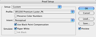
2. Is Epson Premium Luster paper with perceptual chosen for intent. Use Black Point Compensation was activated.
3. Is set to Premium Enhanced Matt, perceptual chosen for intent, Use Black Point, and Paper White are checked.
4. Is set to Windows RGB.
If you use soft proofing and then choose the right setting in all the print dialog boxes, in most cases the image will print very close to what is previewed on screen. It is really important to NOT send mixed print commands to the printer in the various print dialog boxes. Also, remember that the monitor is colored light; ink is applied to opaque paper. Your image will not appear as bright as it does on screen.
This close-up is set with a Luster profile.
Using this paper, we can see that the image is not as saturated and a good deal of the yellow is missing.
If you were expecting all the yellow as well as a deep blue sky, you would not be happy with the colors in the actual print to this paper.

This close-up is set with a Luster profile.
Using this paper, we can see that the image is not as saturated and a good deal of the yellow is missing.
If you were expecting all the yellow as well as a deep blue sky, you would not be happy with the colors in the actual print to this paper.
If you use soft proofing, you can adjust the way the image looks on screen, and then use it as the rendering intent.
But, if you happen to send mixed signals, as often happens, you could easily send an image that looks great in soft preview mode, but then instruct Photoshop to print it with another intent. Result: looks good on screen, but looks very bad in print.
A good workflow is, to use Adobe RGB and edit your image, making all the needed color correction etc. Then save the corrected image. Once the adjusted image is saved, use the soft proof preview to adjust the image as needed for that particular paper profile. Save this file using the Save As option with the proof name attached ( e.g., palmtree-Matt.psd). Therefore you will have your original improved image to start from again should you choose to use a different paper and profile, and a copy of the adjusted image for whatever profile was chosen should you wish to print another copy on that particular paper. If you are familiar with Adjustment Layers, you could make a set of adjustments for each of the paper profiles you use in a single file, thereby eliminating the need to have many copies of the same image.
Printing the file
Desktop printing can be very tricky. It is important for you understand the difference between letting the printer control the printing process or Photoshop control the printing process. Its very easy to accidentally send mixed messages to the printer when making your printing selections.
As with all color printing, it is best to do sample prints of a selected area using different printers settings to find the best setting for your image. Please read more about setting up and printing with the Epson color printer in the computing site.